Now that's where the thrifted repainted cupboard has finally got installed - at the second long side of the room. The first long side was made back in August - click here (by the way I apologize for those pictures with weird sight angles from August 2013, I'll try to make better ones that would look more normal and keep you posted).
Basic concept for entire room:
The basic concept was taking "normal" furniture (by normal I mean not expressively childish, like scalloped, over-decorated, or only suitable for like couple of years). Which doesn't necessarily mean that the room has to look severe or neutral. By all means if there's something I didn't want the room to be, then neutral. My idea was taking timeless neutral pieces, that we can easily re-adapt into another age slice later, being neither girly, nor boyish, since we have a girl and a boy. Now there're pieces that can one day move into my studio or another room.
Next step was going to add LOT of color to create a playful ambiance, and later to add some accessories to soften and round it all up. That's it!
Now about the kitchen nook and everything else around:
The kitchen nook BEFORE was a simple toy stove from BRIO, in red, and a plastic box filled with supplies, utensils and other pieces. Period.
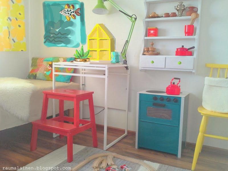
The plastic box has gone and that nice upcycled thrifted cupboard has come in, repainted in white, filled with thrifted pieces to play with - in copper, wood, red plastic and pottery.
The red BRIO stove has turned that deep teal shade - one coat of primer, two coats of aqua based, indoor gloss paint. First - the stove couldn't remain red (we already had some red pieces), second - the way BRIO made finishing and lettering was not awesome, AND the upper desk of that stove was simply bad. I've cut/sawn a piece of thin board, painted it white and glued three black circles made of adhesive black board foil. Now THAT'S the stove that makes me happy all way round!
The yellow chair (thrifted and repainted) just takes on the color of our curtain panel which I've made of MARIMEKKO fabric with Unikko motif by Maija Isola in happy yellow and light shiny green.
Now that's THE fabric I've never ever had imagined getting interested in, let alone purchase in my life before. BUT, living in Finland influences me in a way that I'm ready to take risks and going more unlimited with colors. This is my vitamin D, if you like. AND that Marimekko fabric has colors in it I've never seen in such intensity anywhere else, yes, those people know how to get hell out of it, the colours are pure pleasure and joy! You should have seen it in action - when the days are short and grey, with no decent sun rays for months, that bright curtain panel instantly illuminates the room, it's just THAT happy!
Now that's THE fabric I've never ever had imagined getting interested in, let alone purchase in my life before. BUT, living in Finland influences me in a way that I'm ready to take risks and going more unlimited with colors. This is my vitamin D, if you like. AND that Marimekko fabric has colors in it I've never seen in such intensity anywhere else, yes, those people know how to get hell out of it, the colours are pure pleasure and joy! You should have seen it in action - when the days are short and grey, with no decent sun rays for months, that bright curtain panel instantly illuminates the room, it's just THAT happy!
Styling ideas (to try out, look for/thrift, craft and blog about later)
That question is now about filling the space, because there're still big white wall spaces all around, and it looks colourful, but empty! I was thinking of something which would not necessarily include narrow shelves, filled with cute toys, lots of framed art, buntings, exposing books or alike - something that I DO love seeing anywhere else, but which would possibly make the room look too busy in real.
Photo shoot helped me better realize what could possibly be missing. Keeping in mind, that I didn't want it to turn too childish. Some more big color splashes placed on wall around that white extensible IKEA desk by the bed. So that's what that simple PS-rendering makes better understand.
I guess an upcoming project would be this fish painting in blue (Nr.1) to balance the teal stove, and a yellow display desktop box looking like a house (Nr.2) as an interlink between the yellow curtain panel and a yellow chair. A re-purposed can painted in light warm blue - Nr.3 - (near the yellow house, next to the desk lamp). And we also need a plant - a succulent (easy to care, robust). Preferably in a old thrifted copper vessel (Nr.4). Sounds like a LOT of new upcoming blog content!
I guess an upcoming project would be this fish painting in blue (Nr.1) to balance the teal stove, and a yellow display desktop box looking like a house (Nr.2) as an interlink between the yellow curtain panel and a yellow chair. A re-purposed can painted in light warm blue - Nr.3 - (near the yellow house, next to the desk lamp). And we also need a plant - a succulent (easy to care, robust). Preferably in a old thrifted copper vessel (Nr.4). Sounds like a LOT of new upcoming blog content!


